Most jewelry stores on the market favor a luxurious and high-end style, as this perfectly aligns with the aesthetic and positioning of the jewelry. This, in turn, has led to an increasing trend toward homogenization in jewelry store design. So, what if a pink, girly jewelry store design were to be chosen? The girlish design creates a striking contrast with the luxurious and elegant jewelry. Wouldn’t such a store be more unique? Today, let’s examine the store design style chosen by one of our clients and identify the lessons we can learn from this store’s design.
Jewelry store design should create a visual impact
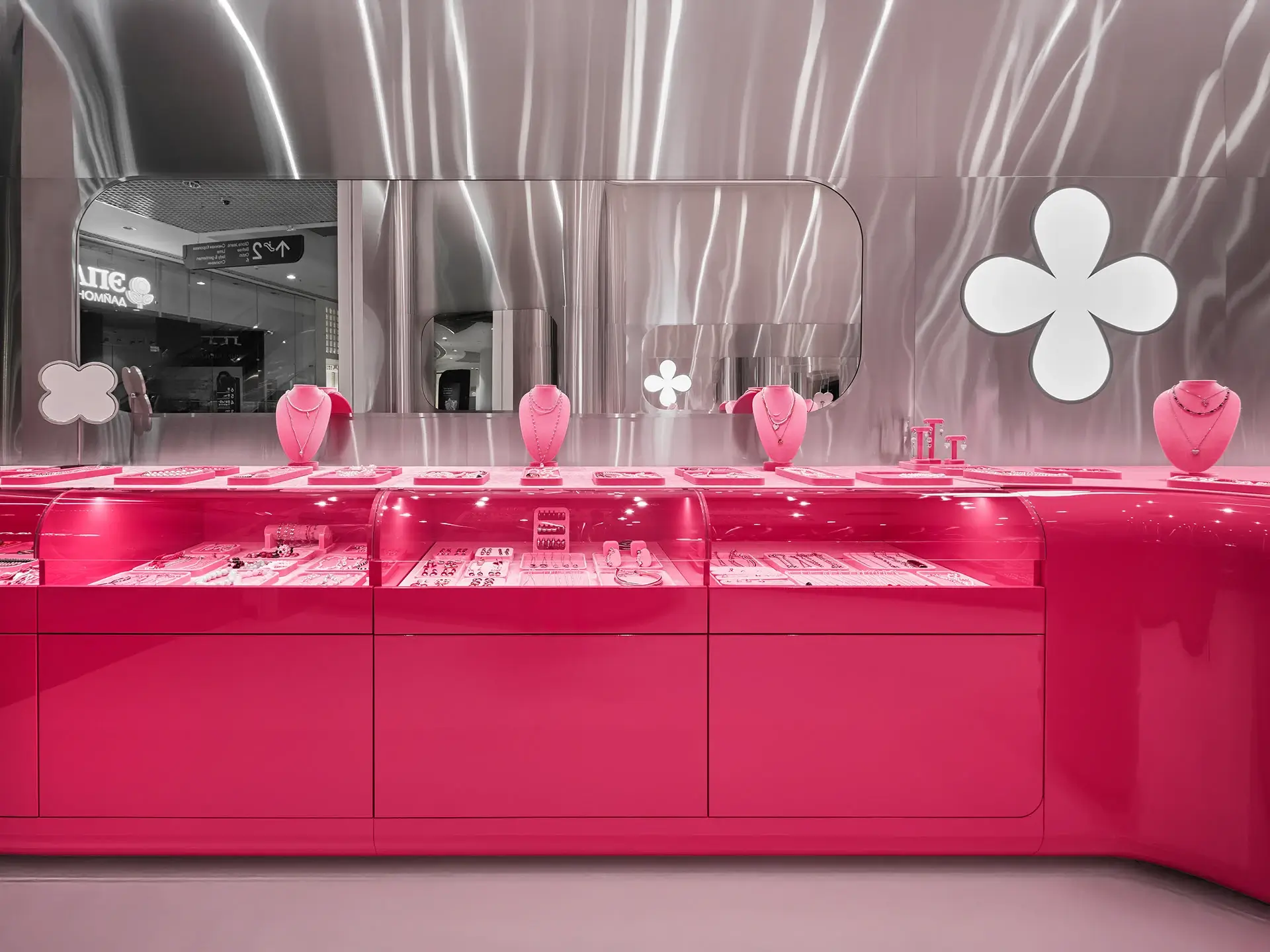
Visual impact is crucial for creating a positive first impression. This store’s color palette not only creates a striking effect, but also its glossy finish creates a strong visual impact. The combination of these two creates a highly visually impactful design.
First, we can see that the vibrant pink jewelry display cases create a striking contrast with the silver-gray background wall. The pink color creates a sweet and stylish atmosphere, while the silver-gray accents enhance the sense of technology and sophistication. Our designers combined these two elements to create a lively and sophisticated space. We can also see the pink jewelry display case, featuring a curved design and a transparent display area, neatly displaying a variety of jewelry.
Finally, the pink jewelry racks make it easy for customers to browse and select. The white four-leaf clover logo on the wall is a striking brand symbol, instantly conveying the brand’s uniqueness. The white four-leaf clover is highly recognizable, significantly strengthening the brand image. The flowing silver-gray background wall texture, combined with the uniquely shaped mirror, significantly enhances the space’s sense of layering and design.
The importance of jewelry store space layout
A well-designed space layout can effectively guide customers’ purchasing decisions. We’ve seen many jewelry store owners pay close attention to space layout. A well-designed space layout can achieve twice the result with half the effort. We typically use traffic flow design to guide customers, often employing S-shaped and U-shaped traffic flow designs. This helps guide customers naturally through all areas, avoiding blind spots.
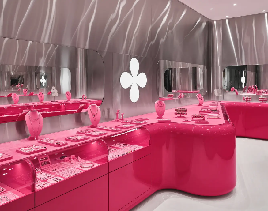
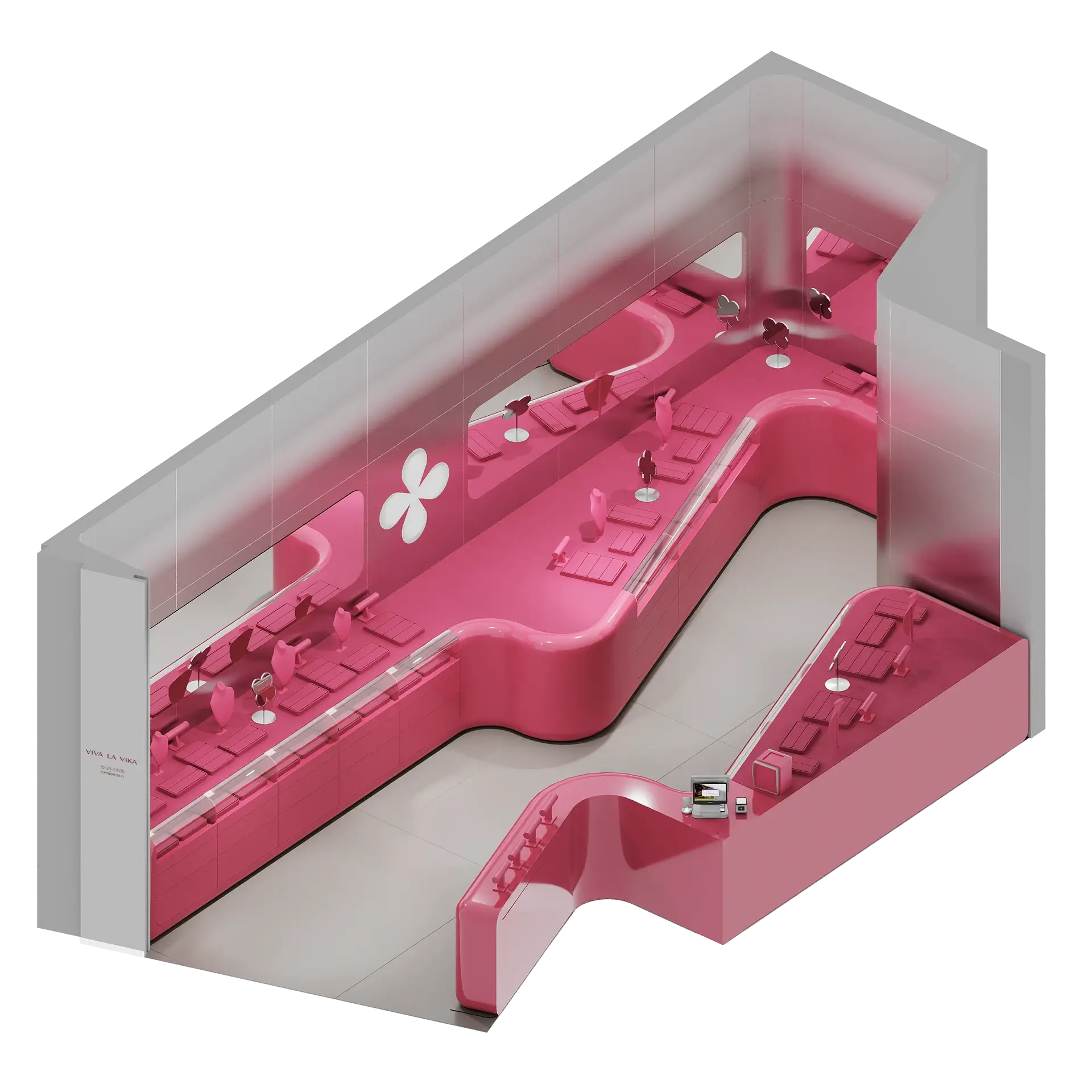
Let’s take a look at the 3D renderings of this jewelry store. We can clearly see the jewelry display cases’ smooth, curved design. This breaks the monotony and rigidity of the otherwise straight lines, creating a flexible space. As for the functional divisions, we see the long jewelry display case on the left, used to showcase various jewelry items. The transparent display area and pink jewelry racks highlight the exquisite details of the jewelry.
The right area houses the cashier and the boutique display area. This design effectively separates the functions of the two sides, ensuring each performs its own function. This results in a compact layout and clear functionality for the entire jewelry display case.
After analyzing the jewelry store design in the picture, are you also thinking about opening your own store right away? If you’re hesitant about which manufacturer to choose, I can assure you that choosing us will not disappoint you. We have 17 years of design and production experience and a professional design and production team. If you have any questions about store design, please click on the online consultation chat box, and we will provide you with professional answers.