Design
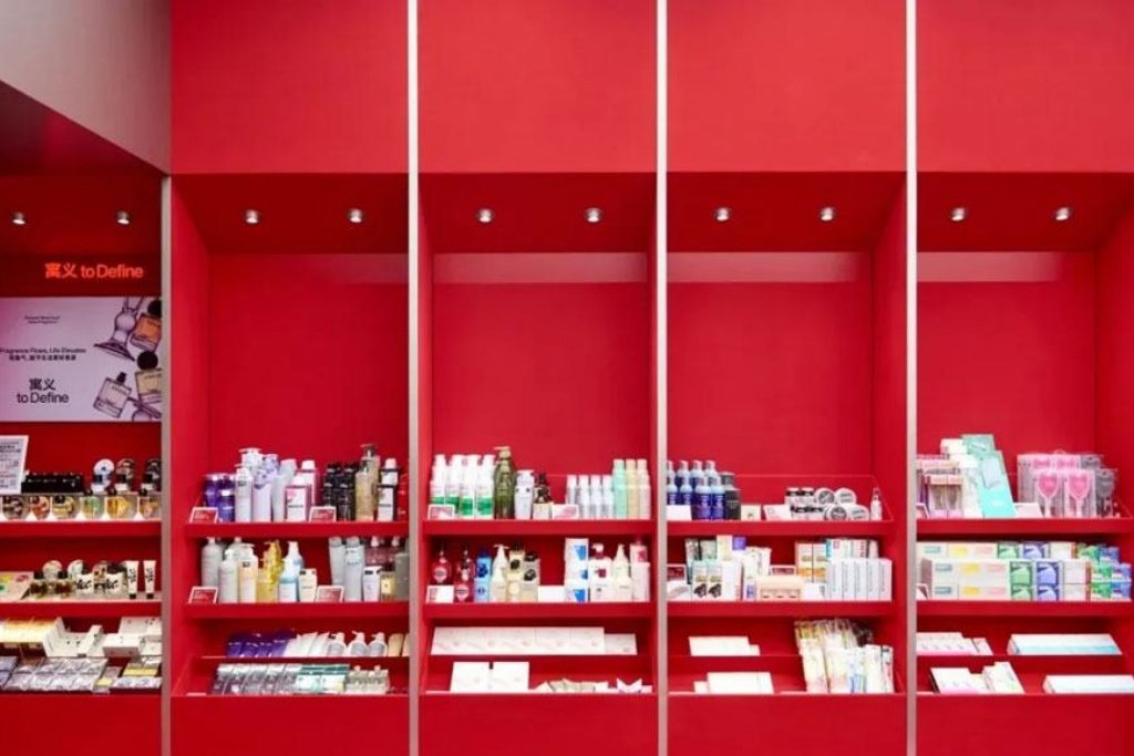
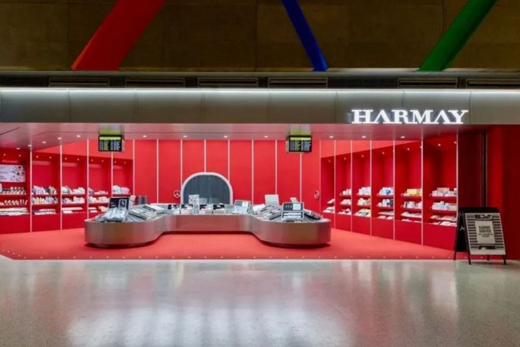
The beauty store HARMAY has chosen a highly saturated bright red as the main tone of its space. This color has the natural advantage of instantly catching the eye and enhancing memory in visual communication. In relatively neutral public spaces, red forms a strong visual barrier that separates the brand from the complex environment. The design precisely conveys HARMAY’s brand personality of being young, bold, and avant-garde. At the same time, transform the entire store into a huge red art box. Beauty products are no longer merely goods for sale but exhibits on display in art boxes. Consumers can enjoy an immersive aesthetic experience of visiting an art exhibition during the shopping process, which perfectly meets the contemporary consumers’ pursuit of a composite demand for consumption, social interaction, and aesthetics.
Spatial layout
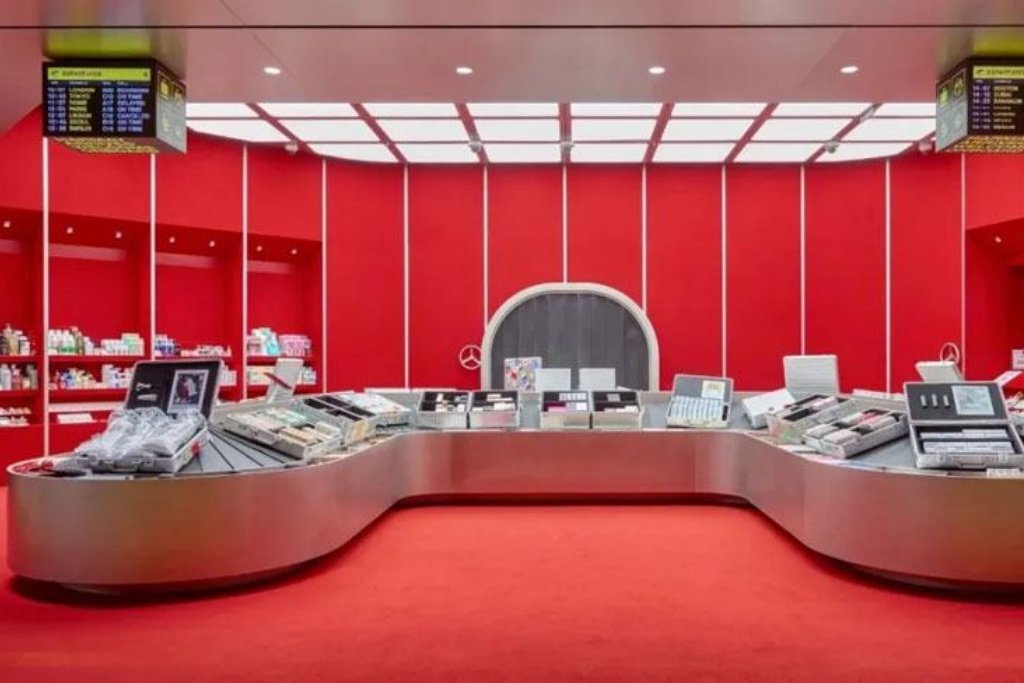
The silver arc-shaped central island in the center of the store is a huge display stand inside. It creates a sense of fluidity with smooth curves, echoing the attributes of beauty products that pursue texture and experience. The surface of the central island is fully displayed in 360° dimensions and naturally divided into multiple service units. Consumers can browse and try out the product from any angle, greatly enhancing the interactive experience. Meanwhile, the arc-shaped form guides the flow of people to naturally circle around and avoids congestion. The embedded shelves with a red background wall adopt a vertical and horizontal zoning logic. Each shelf unit is like an independent beauty display window. The red backplate maximizes the presentation of the color and texture of the product packaging.
The space also conceals a trial experience area, with an implicit circulation route from the surrounding shelves to the integrated cashier on the central island. The open display on the central island encourages consumers to try it out boldly. The surrounding zoned shelves help consumers select products precisely. Finally, the customer completes the settlement loop on the central island. Make the entire shopping process efficient and rhythmic, and quietly complete the commercial transformation in an artistic atmosphere.
Material expression
The central island is made of silver metal, and its surface is treated with a matte or frosted finish. This way, it not only retains the industrial coldness of the metal but also avoids the visual interference caused by excessive reflection. The coldness and hardness of metal collide violently with the warmth of red. This collision eliminates the sense of cheapness in the space and precisely anchors HARMAY’s positioning as a high-end beauty collection store.
The red of the walls and the floor is not a single material but a layered design of the finish and the carpet. The wall is made of high-density red boards, with a smooth surface and pure color. The floor is covered with a red carpet. From the moment consumers step into the space, they can perceive the strong creation of the scene from both the tactile and visual dimensions. The white metal frame of the embedded shelf contrasts with the red wall shape. This not only divides the shelf areas but also adds a visual layer. There are recessed downlights on the top of the shelves and the ceiling. Uniform lighting ensures that the light gently falls on the product, highlighting its texture while avoiding glare.