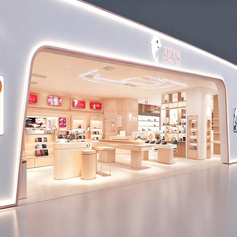
The image shows the “Dolphin REE” store. From the outside, the cosmetic store’s design is simple and stylish, with a predominantly light color palette and soft lighting creating a warm and sophisticated atmosphere. Inside, a wide variety of products are displayed, with neatly arranged shelves for easy browsing and selection, creating an overall comfortable and high-end shopping experience. The store is committed to providing consumers with high-quality products and a pleasant shopping environment. As we can see from the pictures, the overall design style of this store is high-end and fashionable. In our traditional perception, cosmetics retail stores should be brightly colored. However, this store focuses on providing customers with a comfortable shopping experience and environment. The color matching and lighting coordination are very important, as well as the selection and layout of the product display counters.
Layout and Cosmetic Showcase
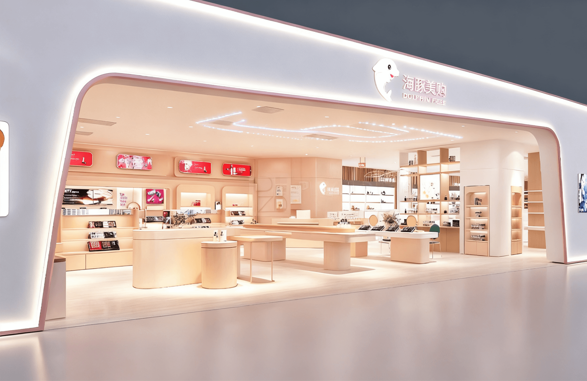
The store’s primary color scheme is light wood, creating a warm and elegant atmosphere. A variety of beauty products, including lipsticks and makeup sets, are displayed on the cosmetic display shelves. Lightbox advertisements in the display area highlight product features and the brand image. The store’s neat layout and orderly display of products make it easy for customers to browse and purchase. The soft lighting and minimalist decor enhance the overall shopping experience, creating a beauty retail space that integrates brand display and product sales.
This store has a spacious layout. Products are neatly displayed, and the cosmetic display counters are designed in a consistent style. First, let’s take a look at the main display area in the center of the counter. The counter’s design is simple and high-end. We used an MDF base with a matte finish. The matte finish creates a harmonious and softer look throughout the store. Three shelves display the store’s core products. The bottom shelf features storage drawers, which helps conserve space. In front, there’s a solid wood round table, where ornaments decorate the display cabinets. You’ll notice that the sides of the display cabinets are equipped with display shelves, making full use of the entire cabinet space.
Finally, let’s look at the wall cabinets. As you can see, the entire wall cabinet serves as the main display area, with LED lights on each shelf to illuminate the products. The wall cabinet’s design is quite unique. A rectangular outer layer adds to the store’s sense of space and three-dimensionality. The light box paintings on the wall cabinets serve as brand promotional elements.
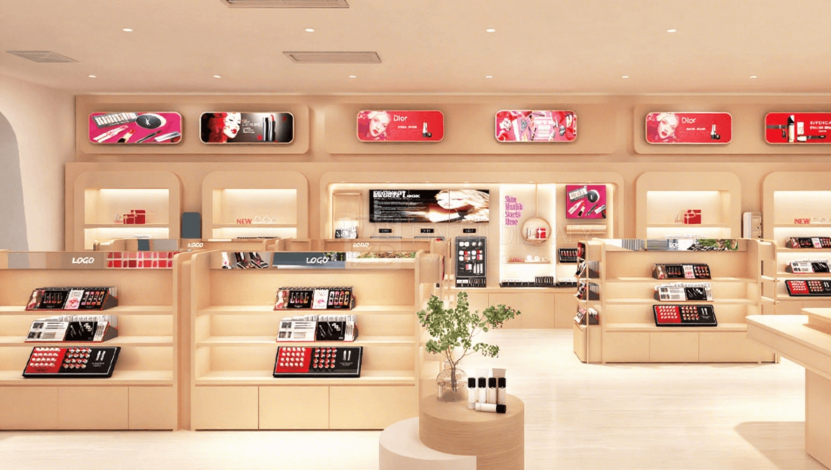
Matching Lighting with Store Color in Cosmetic Shop Design
This image is also from the same store. Because the store is divided into many areas, each with a different color palette and style, let’s explore the color and lighting choices for this area. We can see that the overall color scheme is low-saturation. It’s primarily a combination of white and light pink, with metallic accents. The lighting is pure white, like midday sunlight, not cold white. This is because the characteristics of cosmetics, and when customers are trying products, require lighting that reflects the natural color of their skin. This color palette is used to highlight the customer’s beautiful skin.
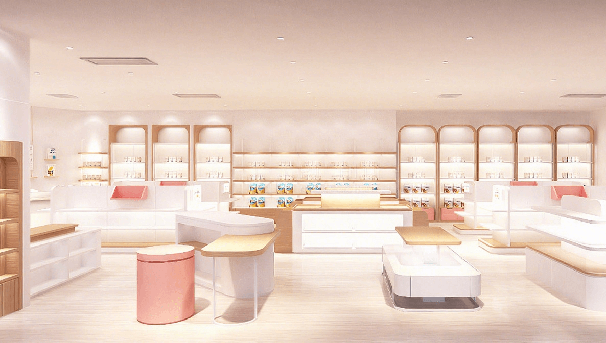
After analyzing the cosmetics store design in the picture, are you also thinking about opening your own cosmetics store right away? If you’re hesitant about which manufacturer to choose, I can assure you that choosing us will not disappoint you. We have 17 years of design and production experience and a professional design and production team. If you have any questions about store design, please click on the online consultation chat box and we will provide you with professional answers.