Modern and Simple Clothing Store Furniture Introduction
In the competitive landscape of fashion retail, your store’s environment communicates your brand’s values. Influences customer perception, and directly impacts purchasing decisions. A thoughtfully curated space is the cornerstone of modern retail success. Whehter you are looking for a luxury or simple decoration clothing store,you can find good solution on our website. We will dissect the core components of this design to provide you with a actionable blueprint store. Highlights your merchandise, enhances the customer journey, and drives commercial success.
Minimalist Color Palette
The foundation of any impactful visual merchandising strategy begins with color. The off-white and dark gray scheme is a masterclass in minimalist sophistication. Which is a calculated strategy. The off-white walls and primary surfaces act as a luminous, neutral canvas. Possesses a unique ability to reflect and amplify ambient lighting. Ensuring the entire space feels open, airy, and inviting. More importantly, it prevents color casting, allowing the true hues, textures, and details of your clothing. Whether a vibrant dress, a delicate blouse, or a structured coat creates a gallery-like atmosphere. Where the products themselves are the art.
Contrasting this lightness, the strategic use of dark gray. Likely in furniture frames, signage bases, or architectural accents, provides essential visual anchor and definition. Interplay between light and dark creates a sense of depth and structure within the space. From a psychological perspective, this palette projects an image of clarity, quality, and high-end sensibility. It tells the customer that your brand is confident and the focus is squarely on the quality and clothing store design. This environment is particularly effective for brands specializing in clean lines, luxury fabrics, and timeless pieces. As the space itself echoes these values, reinforcing the customer’s perception of the product’s worth.
Trends in color come and go, the combination of neutral tones remains perpetually relevant. This makes it a wise long-term investment, allowing you to update your store’s look season after season. Saimply by introducing new accent colors through soft furnishings, display props, or seasonal collections.

Strategic Entry Point
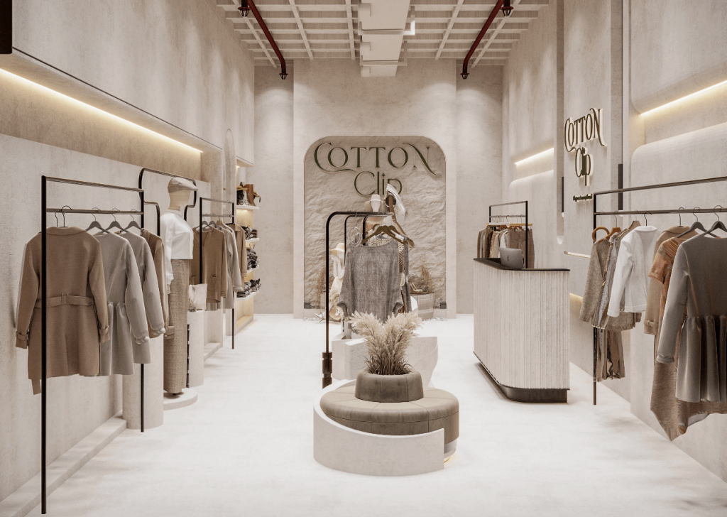
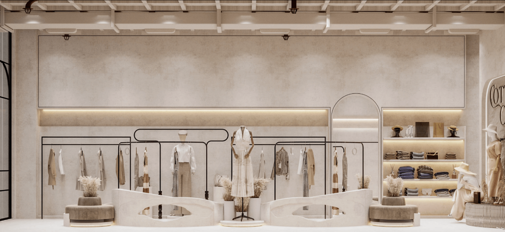
The area immediately inside the entrance, often called the “decompression zone,” must transition the customer into your brand’s universe. In this design, the right-hand wall is leveraged with precision. A coordinated set of metal display racks immediately greets visitors. Presenting a curated assortment of key items. This initial presentation is your opening argument, showcasing your range and style. Metal display racks conveys a modern, industrial-chic aesthetic. Ensuring exceptional durability and a slim, unobtrusive profile.
The organization on these racks is a successful first impression. Grouping items by color and material is a fundamental service to the time-pressed modern shopper. This logical categorization facilitates intuitive browsing. Allowing customers to quickly locate what resonates with them. Whether they are drawn to a specific fabric like silk or cotton or are searching for a particular color palette. This reduces initial friction and encourages engagement from the moment they step inside. It demonstrates a respect for the customer’s time and a high level of merchandising expertise.
This zone also often features new arrivals or hero pieces. Capitalizing on high visibility to generate immediate interest. Presenting a well-organized, accessible, and visually appealing selection right at the entrance. You effectively capture attention and set a tone of order and quality. This strategic placement encourages customers to move deeper into the store. Confident that they will find a well-managed and desirable collection throughout the space. It is the first step in a carefully choreographed customer journey designed to build trust and interest.
Integrated Service Hub
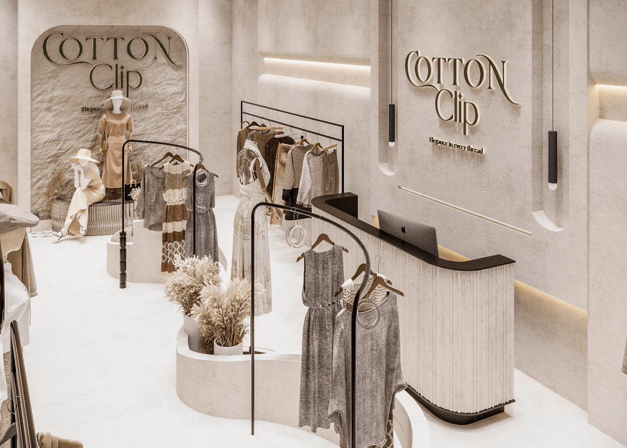
The service counter and brand feature wall represent the operational and symbolic heart of the store. This is a multi-functional hub to embodies the brand’s identity. In a high-traffic area, sharp corners are a liability. Replacing them with soft, flowing curves is a proactive safety measure. Prevents accidental bumps and injuries, contributing to a more relaxed and secure environment.
Curved counter is more inviting. It physically and psychologically breaks down the formal barrier between staff and customer. Fostering a more approachable and consultative atmosphere. This is where the operational meets the experiential. integrated luminous brand logo on the feature wall above serves as a constant, powerful brand reminder. Strategically placed lighting ensures the logo is perpetually in focus. Reinforcing brand recognition and imprinting your store’s concept into the customer’s memory. View clothing store furniture
This consolidated area efficiently handles multiple functions. Point-of-sale, customer inquiries, returns, and acting as a visual anchor. Designing it with both aesthetics and utility in mind, it becomes a seamless part of the store’s narrative. Materials matching the dark gray and off-white palette with perhaps a complementary material like a honed stone or rich laminate for the countertop.
The Focal Display Wall
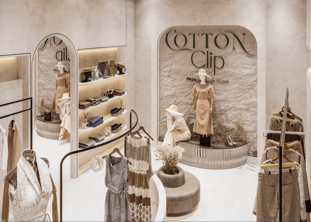
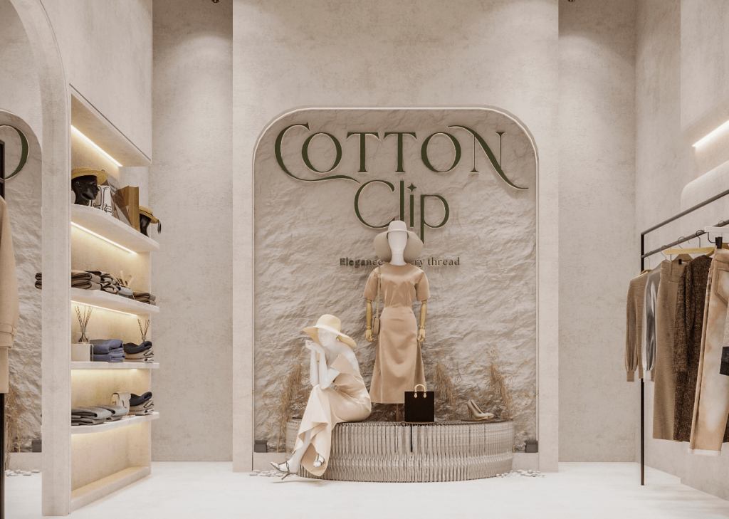
Creating a memorable “wow” moment within a retail space is crucial for differentiation. The back wall, designated as a focal display area, achieves this by combining texture, art, and product staging. Textured rock or stone cladding introduces a powerful, elemental contrast to the smooth, minimalist surfaces elsewhere. This tactile feature wall adds a layer of depth and sophistication. Visually interesting and physically engaging encourages customers to approach and interact with the space.
This wall is the ideal stage for your most important narrative. Placing fully styled mannequins here is a proven merchandising technique. It allows customers to intuitively understand your brand’s styling philosophy. Separate pieces—a top, a bottom, and accessories—come together to form a complete, compelling look.
Moreover, the strategic genius of this design lies in its seamless integration of function. Position the entrance to the fitting rooms directly behind this striking feature wall. You effectively conceal a necessary but less aesthetically pleasing operational area. This maintains the immersive and curated atmosphere of the main shopping floor. The textured wall acts as a beautiful and distraction-free buffer, ensuring customer privacy is respected.
Engaging the Lateral Space
A successful store design engages customers on all sides. The left-hand wall is a prime opportunity for increased display density and customer interaction. Utilizing a combination of wall-mounted shelving and display racks creates a dynamic and varied shopping experience. This mixed-media approach prevents visual monotony. Shelving units are perfect for neatly folded knits, denim, handbags, or shoe displays. While display racks allow for the full-length presentation of hanging items like coats, trousers, and dresses.
A critical element here is the full-length arch door mirror. This is a strategic tool that serves multiple purposes. Firstly, it provides an immediate and convenient way for customers to check the fit and drape of a garment they are considering. Even before they enter a fitting room. Secondly, and just as importantly, the arch shape of the mirror introduces a soft. Architectural detail that complements the curved service counter, creating a cohesive design language throughout the store. It also has the practical effect of making the space feel larger and brighter by reflecting light and the view across the room.
This lateral zone is further activated by the introduction of a central seating element—a round sofa. This provides a crucial resting point for companions. Making the shopping experience more comfortable for groups. It also enhances the perception of your store as a welcoming, service-oriented destination. The “S”-shaped fence with integrated metal racks acts as a gentle guide. Directing customer flow while simultaneously creating additional, eye-level display real estate for featured items.
The Psychology of Flow
The ultimate success of a retail layout is measured by its flow, intuitive journey a customer takes through the space. This design exemplifies a strategic “loop” or “racetrack” layout. Entrance displays placement, the central seating/fence element, and the focal back wall, guides customers in a comprehensive circuit around the entire store. Ensures maximum exposure to your entire product range and minimizes missed areas.
Every element we’ve discussed works in concert to support this flow. The open sightlines from the entrance to the textured back wall create an immediate draw. The curved counter and “S”-shaped fence use soft geometries to direct movement. The strategic placement of the mirror and seating creates natural pauses and points of reflection, preventing fatigue. This careful choreography increases dwell time, duration a customer spends in the store. The longer and more comfortable a customer feels, the more they will browse, connect with your brand, and ultimately, make a purchase.
This holistic approach to spatial planning is what separates a good store from a great one. Where every piece of furniture and every architectural detail is considered for its role in the customer journey. Leading customers through a narrative of your collection, from initial attraction at the entrance, to brand connection at the service hub. Styling inspiration at the focal wall, and finally, to the practical consideration of the fitting room.