Cosmetics Store Design Pitfalls: Don’t Let These Details Drive Away Your Customers
In recent years, more and more people have chosen to open beauty and cosmetics stores. Driving customers not only by changing aesthetic trends but also by the increasing profitability of beauty and cosmetics stores. Therefore, the design of beauty and cosmetics stores has become a crucial consideration. Whether a beauty and cosmetics store attracts customers depends not only on its external appearance but also on its internal spatial layout.
Many beauty and cosmetics store owners invest heavily in the store’s exterior design, while neglecting the all-important internal layout. This is a common mistake for many store owners. Scientific design can maximize the return on investment and, most importantly, increase customer retention and capture their attention. So, what are some common pitfalls that store owners often fall into?
1.Messy Display and Goods
The first pitfall is cluttered displays and a lack of proper product categorization. Some stores, to appear to have a comprehensive inventory, overcrowd the shelves. Lipsticks are piled high, and skincare products are arranged in squares. As a result, customers can’t even discern basic product information. Product display should follow logical principles. Allow products to breathe. Products of the same category should be displayed together, with clear distinctions based on color or efficacy. We should arrange shelves lightly on top and heavy on the bottom, and place items lower in front and higher in the back. We need to prioritize best-selling products.We should display these products in prime display locations, at or slightly below eye level.
2.How to Adjust our Display Shelves?
Now that we’ve discussed the essential techniques for product display, the choice of display shelves is equally crucial. While there are many options for shelves, we need to choose shelves with ample space and high-quality materials to effectively showcase our products. Furthermore, shelving selection should also adhere to the principle of diversity. However, this doesn’t mean choosing shelves of all shapes. Rather, it’s important to choose shelves that complement your store’s style. This will enhance your store’s design.
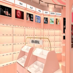
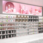
Let’s take a look at a cosmetics store our factory designed last year. This is a great example. As you can see from the image, we neatly arranged the cosmetics shelves. In the center is a marble countertop with original grain. The center section of the counter features drawers for storing our items. We display samples on the countertop for customers to try. We make the shelves on the right with MDF and give them a lacquer finish.They hold different types of cosmetics. Our wall cabinets are simple cosmetic display racks, featuring different shelf styles. Made entirely of solid wood, they highlight the fresh, pristine environment of the entire cosmetics store.

3.Wrong Use of Lighting
Incorrect lighting can significantly diminish the customer experience. Lighting is the key to enhancing the beauty of cosmetics, but excessive use can have the opposite effect. Some stores, seeking brightness, use high-intensity white light directly on products. This can cause lipstick to appear falsely white and eyeshadow to lose its depth. Professional lighting design should be regulated by specific zones. The makeup area should use a neutral light of around 4000k to highlight colors and restore their original appearance. The skincare area should use a warm light of 3000k to create a gentler feel. This ensures that makeup trials look the same as everyday makeup.
As you can see in the picture, the lighting uses warm white light, creating a comfortable atmosphere. It’s not glaring, and the products aren’t obscured. We’ve designed a dedicated lighting area for the display case on the left. Hexagonal acrylic panels in different colors.And it creates a vibrant lighting atmosphere.The circular chandeliers on the ceiling are distributed in various parts, which can make the lighting of the entire store look more uniform and harmonious.

4.Showcasing a Unique Design Element
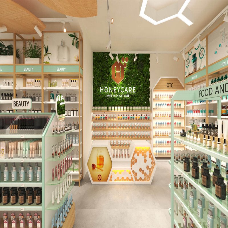
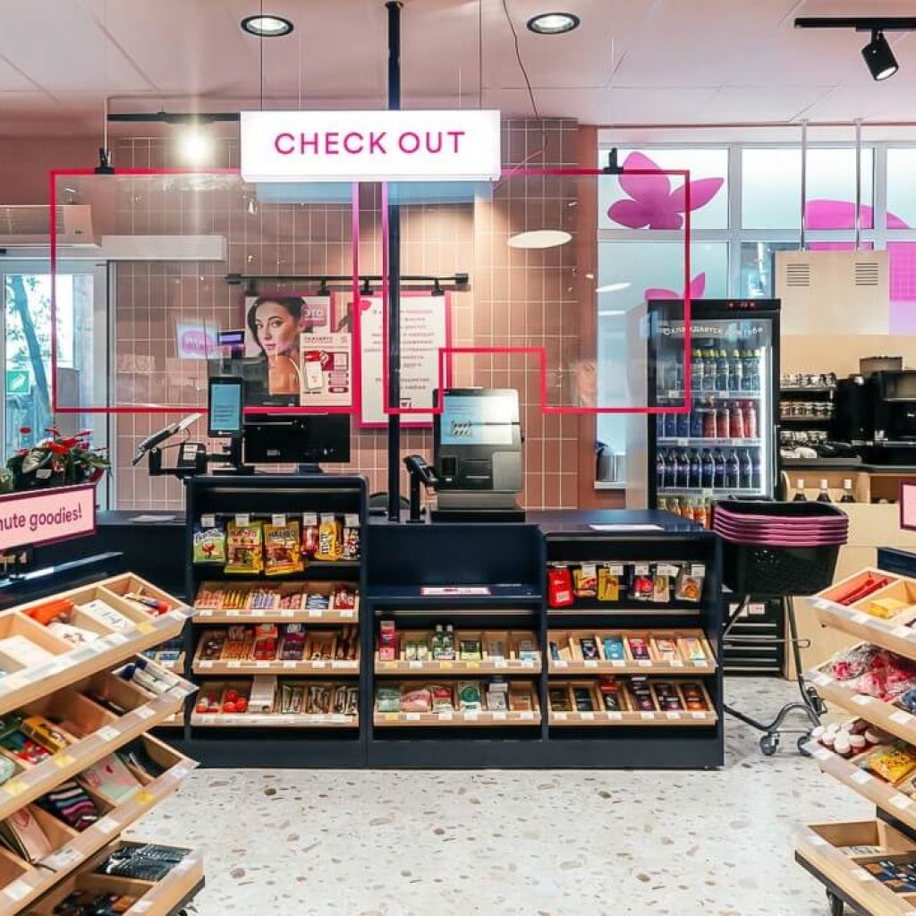
We can clearly see that the cosmetic display counter design is very unique. The cash register is immediately captivating upon entering the store. We best place this design right when customers first enter the store, as they first see our brand name. The second thing that attracts them is the counter design.The middle area features the brand’s iconic hexagonal decorative elements, with a green plant wall as the background. The brand logo is above and a series of products are displayed below.The design style is natural and recognizable.
Light colors, along with wooden elements and green plants, dominate the overall space, creating a fresh, professional and health-care-focused atmosphere.It integrates multiple categories of care products such as beauty, health, medicine, and food, conveying the brand concept of comprehensive care.This distinctive design perfectly conveys the brand’s philosophy. Combined with the images, it further demonstrates the store’s core values of health, greenness, and environmental protection. It gives our customers a fresh perspective on an unfamiliar brand. This is the charm of adding a unique design element.

Of course, there’s more to this guide than just closing the pit. There’s a lot more we need to pay attention to and a lot to learn.Only by constantly trying and correcting in practice can we eventually reach a satisfactory standard.
After analyzing the cosmetics store design in the picture, are you also thinking about opening your own cosmetics store right away? If you’re hesitant about which manufacturer to choose, I can assure you that choosing us will not disappoint you. We have 17 years of design and production experience and a professional design and production team. If you have any questions about store design, please click on the online consultation chat box and we will provide you with professional answers.