Pure White High End Cosmetics Store Furniture Design
Creating a high-end cosmetics retail environment is a critical business strategy. A common misconception is that luxury requires filling every square inch with product displays. In reality, strategic emptiness and a disciplined color palette are far more effective. Creating a high end cosmetics store design is very important to improve brand and increase sales. No need to place counter in the cosmetics store fully, you will have a luxury and high end shop effect. Today, I want to share a nice cosmetics store furniture with you.
Allure of White
The decision to envelop a cosmetics store in a pure white palette is a deliberate and powerful branding statement. White is a design philosophy. It evokes immediate associations with purity, cleanliness, luxury, and modernity. All essential attributes for a high-end cosmetics brand. Creates a perception of hygiene and trust, customers assuring the products they are about to apply to their skin are held in a pristine environment. Furthermore, a monochromatic white scheme allows the products themselves to become the stars of the show. The vibrant colors of packaging, the metallic sheen of compacts, and the glossy finishes of bottles pop against the neutral background. Drawing the eye and enhancing the perceived value of each item.
From a spatial perspective, white is exceptionally effective at amplifying light and creating a sense of expansive, airy openness. It makes even a compact retail footprint feel larger and more inviting. Preventing a cluttered or overwhelming atmosphere. This sense of calm order is a key differentiator in the often-chaotic beauty retail landscape. The psychological impact is one of relaxation and exclusivity. Encouraging customers to slow down, and browse at their leisure.
Implementing a successful white-on-white scheme requires a masterful use of texture and form. The design must incorporate a variety of materials—glossy lacquered finishes, matte panels, brushed metallic accents. And perhaps veined marble or clear glass. These textural variations create visual interest a tactile richness. Customers experience subconsciously as they move through the space. The furniture’s forms, from curved display cases to streamlined counters. Break up the monotony and guide the customer journey through shape and flow.
Captivating the Window Display
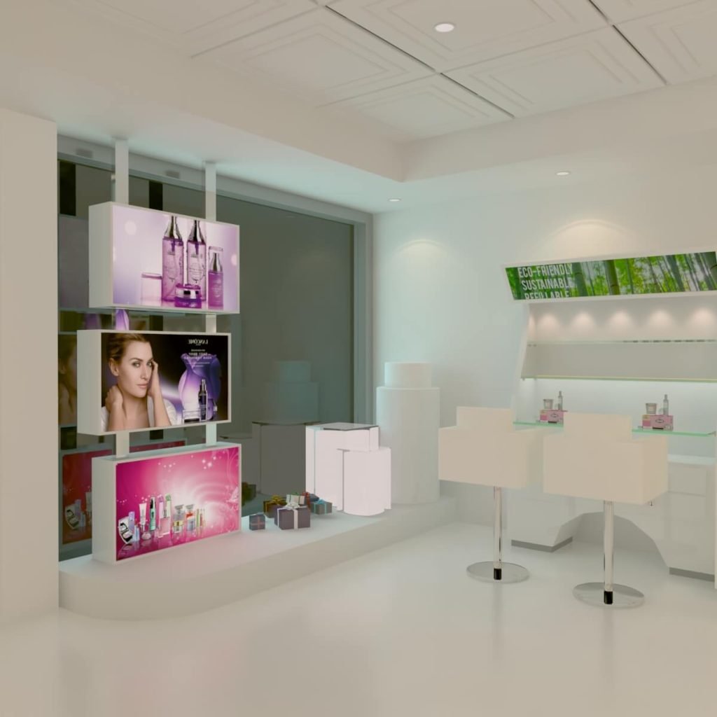
In this pure white design, the window display on the right-hand side is engineered for maximum impact. It features a large advertising zone with three light box posters arranged in a vertical, staggered pattern. This dynamic arrangement is far more engaging than a static, flat wall of advertisements. The staggered layers create depth and a sense of movement. Compelling the eye to travel across each poster. The internal illumination ensures the messaging is brilliantly lit day and night.
Adjacent to these illuminated narratives, the product display takes center stage. A large luminous square stand and a two-tiered round display work in harmony to present cosmetics sets. The combination of geometric shapes—square and round—adds a sophisticated, architectural element to the vignette. The built-in luminosity just light the products from above and makes the display structures themselves appear to glow. Casting a flawless, diffused light that eliminates shadows and makes every product look its absolute best. This is product presentation as art direction.
Small, curated gift boxes are strategically as decorative accents within this display. This is a subtle yet powerful merchandising technique. It visually suggests the concepts of gifting, luxury unboxing experiences, and valued purchases. It helps the customer visualize the product not just on a shelf, but as a treasured object. Together, the illuminated posters, the glowing architectural displays, and the luxury gifting create a multi-sensory invitation.Effectively converting foot traffic into store entry.
Immersive Wall Displays
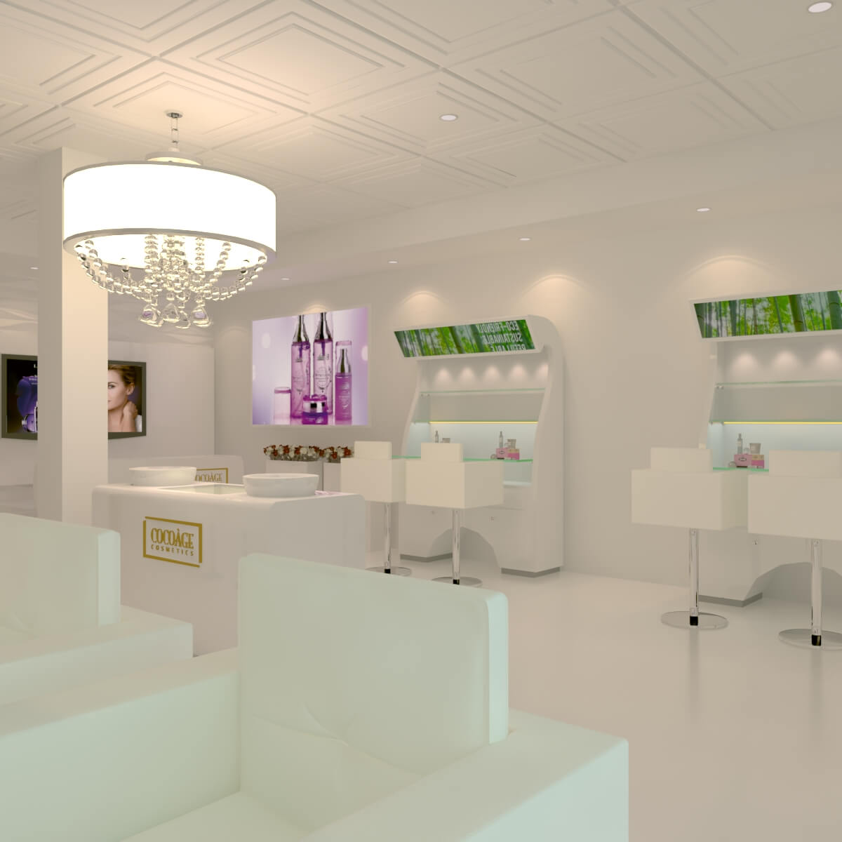
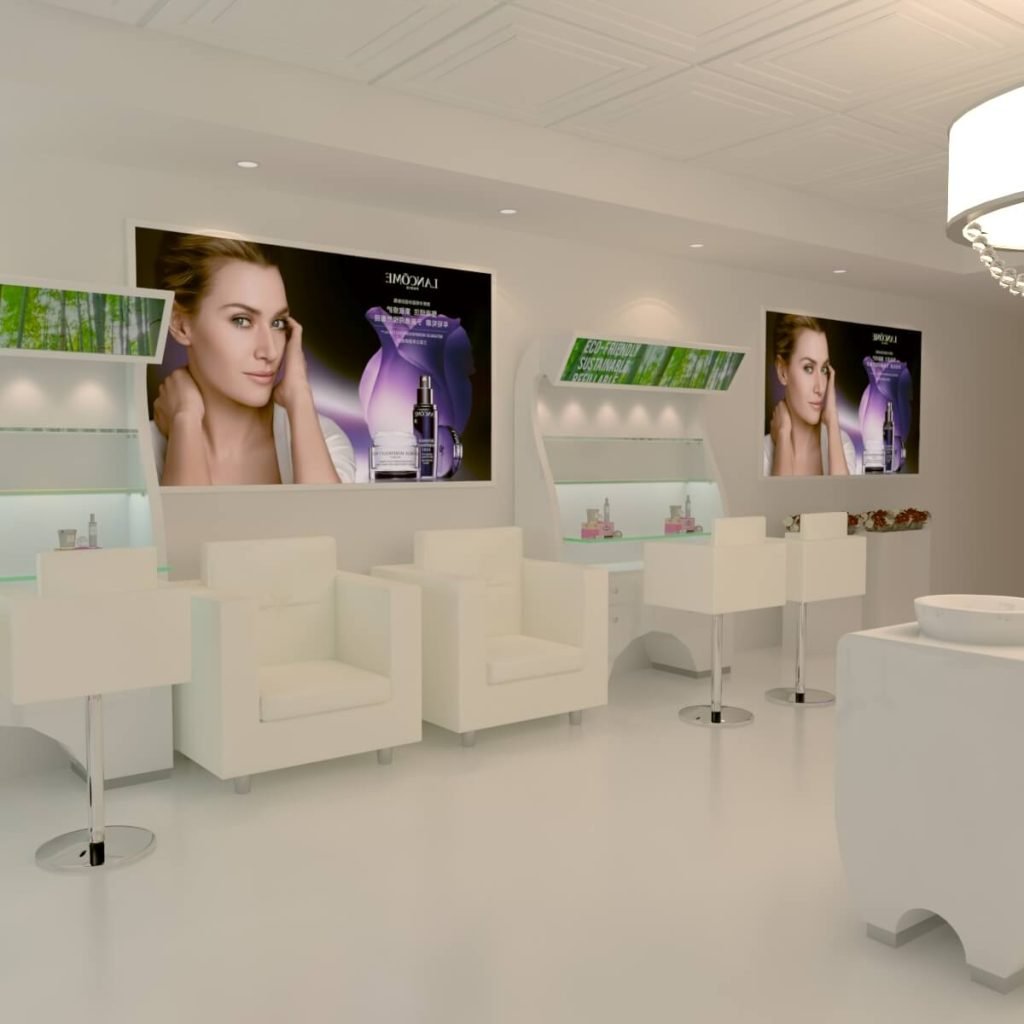
Upon entering, the customer see curved wall display cabinets running along both sides of the store. The curved, or crescent, shape is a significant departure from standard flat shelving. An increased surface area allow for a greater volume of products to be displayed in an organized, accessible manner. More importantly, the soft, flowing lines break down the formal rigidity often associated with high-end retail. Creating a fun, organic, and welcoming atmosphere. The curve naturally guides the customer deeper into the space, or chestrating a fluid browsing journey.
Integrated directly in front of these elegant displays are dedicated chairs or stools. It transforms the shopping experience from a transactional stand-and-browse into a personalized consultation. Customers are invited to sit down, settle in, and comfortably reach for and test their products of interest. This seat fosters a sense of being cared for and encourages a longer dwell time. Which directly correlates to higher conversion rates and average transaction values. This area seamlessly doubles as a station for professional services like makeovers or skincare consultations. Blending retail and service into one cohesive experience.
The top of each display unit has a light box panel, serving as both a practical and branding element. This illuminated surface is for educational content, ingredient stories, or brand ethos messaging. Enriching the customer’s understanding while they seat and engage. To further enhance comfort, a sofa or bench is strategically on the right wall between two displays. This thoughtful addition caters to accompanying friends or partners. Acknowledging that the decision-making process in luxury beauty is often a social one. Above this, large-scale poster artwork maximizes the advertising real estate on the back wall. Adding a dramatic focal point and infusing the pristine white environment with bold, brand-defining imagery.
Central Service Hub
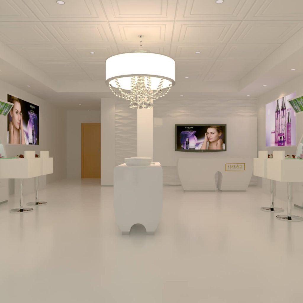
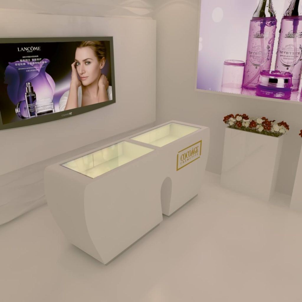
The center of the store is a freestanding individual counter, a design choice reinforces the theme of accessibility and flow. This central island acts as a hub for interaction and practical service. Its most crucial feature is the inclusion of two integrated water sinks. This addresses a fundamental need in the cosmetics trial process. Providing a convenient and hygienic station for clients to wash their hands or cleanse their faces before testing products. This thoughtful provision elevates the entire experience. Signaling a brand cares about the integrity of product application and customer comfort.
The back side of this central counter is a powerful branding statement. It features a large poster wall that acts as a dramatic backdrop. Visually communicating the brand’s core identity. Directly in front of this graphic backdrop is a display counter. Creating a layered visual effect vividly showcases hero products or new collections. This setup tells a story, connecting the aspirational imagery of the poster with the tangible products below. Making the brand’s promise feel immediate and attainable. It is a highly effective method for communicating your business scope and key offerings directly to every client in the store.
Crowning this central hub is the brand signage, set prominently on the counter. In a store that relies on a minimalist color scheme, this signage serves as the primary identifier and a constant reminder of the business you are in. Its placement ensures high visibility from multiple angles within the store, reinforcing brand recall. This central service hub, therefore, is the operational and brand heart of the space. Facilitating practical needs, enabling consultation, and consistently reinforcing brand identity through every customer interaction.