How to Decorate a Small Coffee Shop? 3 Tips to Make 20 Square Meters Look Spacious and Fit People
Many entrepreneurs face the challenge of limited space when planning a coffee shop. A 20-square-meter space, with space for countertops, storage, and seating for customers, can easily feel cramped and oppressive. However, with a well-thought-out approach to decorating, a small space can create a sense of airiness while balancing practicality and ambiance.For many entrepreneurs, choosing the right size of coffee shop is very important. Although a 20 square meter coffee shop is just enough to accommodate customers, it can also be expanded through design, especially leaving free space for customers to rest.Today I will introduce three efficient and easy-to-use methods to make a 20-square-meter coffee shop look spacious and comfortable.
Choose Lightweight Furniture
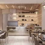
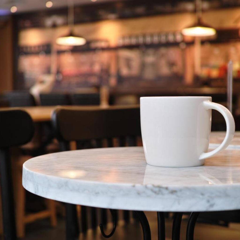
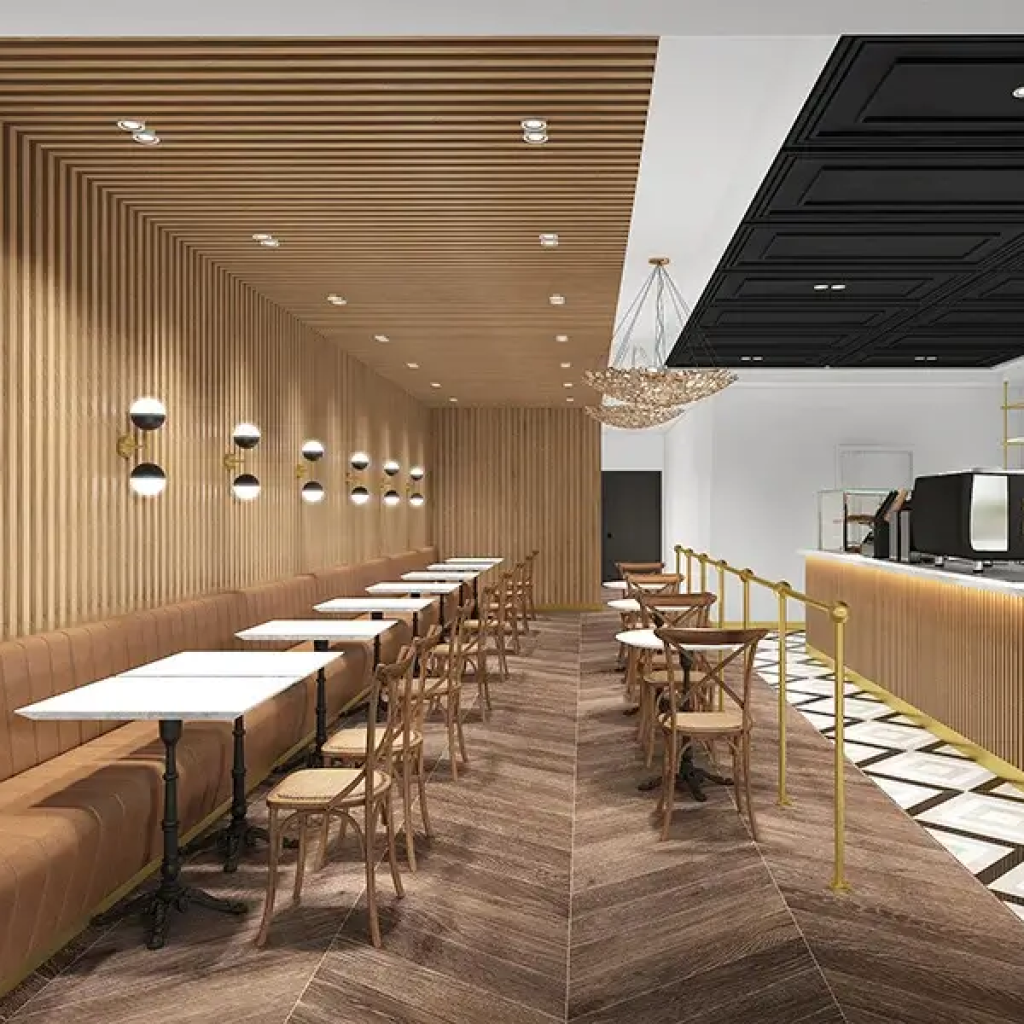
We know that the layout and selection of coffee shop furniture in a coffee shop are crucial. For coffee shops with limited space, it’s best to choose lightweight tables and chairs. Avoid bulky designs and opt for tables and chairs with slender legs, like the furniture pictured. The table features an artificial stone top, while the chair legs are made of metal with a black lacquer finish. The chairs are made of solid wood. The low-saturation wood color creates a larger space.
The sofas in the customer lounge area also save space. The design of the entire row of sofas against the wall matches the table and chairs very well.The spotlights on the wall are also small and light, which not only adds decoration but also saves space.The ceiling lights are bowl-shaped metal pendants. The overall design is very unique. They illuminate the entire store while also adding a decorative touch.
The One-line Bar Saves Space for Activities
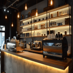
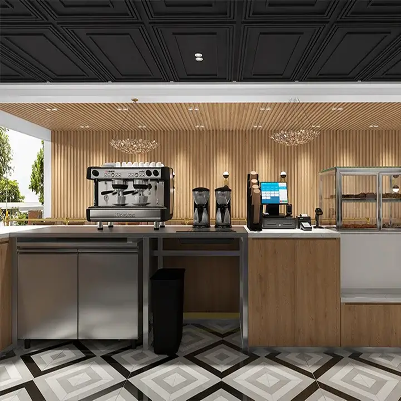
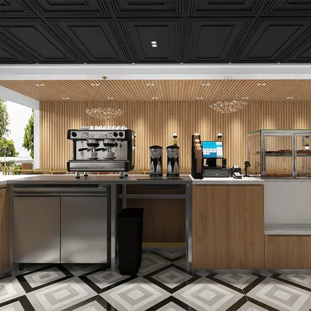
As we just mentioned, choosing lightweight furniture can have a positive impact on the visual and spatial aspects. At the same time, our store decoration also presents a unique design. This is very necessary.Our specifications are for a lounge area for the client, and we are now discussing the design of a coffee counter.The coffee shop photos in the picture are from renderings produced by our factory. As you can clearly see, the coffee counter is designed in a straight line. This significantly reduces space. As we know, making coffee requires many steps, so this is crucial for the staff’s work area.
The coffee making station features a coffee machine, grinder, and cash register. The design in the image puts these three functional areas in a straight line. This not only saves a lot of space, but also makes the barista’s work more convenient and efficient.The design of the coffee cabinet is also very important. There is a storage cabinet under the cabinet, and there are drawers under the bar to store things, which can replace independent storage cabinets. This can better store our coffee ingredients. We can see that the coffee counter is designed with metal shelves. The stainless steel material is powder-coated, which is both stylish and practical.
Customer flow is also crucial. Avoid the invariable habit of walking in circles after entering. The correct flow should be a straight line from the entrance to the ordering area, then to the pick-up area, and then to the seating area. Aisles should be at least 80cm wide to allow two people to pass sideways. Low-profile display cabinets can replace solid partitions to separate the ordering and seating areas, ensuring visibility and encouraging a natural flow of customers.

Color Selection Amplifies Space
Having addressed the most common issues above, let’s move on to a frequently overlooked issue: the store’s color palette. By utilizing visual extension techniques, the exterior space appears 20% larger. As you can see from the image, the low-saturation brown color chosen for the walls, paired with the stainless steel and solid wood counters, avoids monotony while visually stretching the space.For color matching techniques, you can read relevant professional books. Because there are many color categories, we need to match them with corresponding colors. Color matching can greatly influence customers’ visual perception. A good color scheme can make a store appear brighter and more spacious. However, if we fail to pay attention to color matching techniques and choose an inappropriate color scheme, our store will appear even more cramped.
It’s worth noting that the floor tiles feature a geometric pattern. The combination of black, gray, and white, along with the diamond pattern, lends the space a stylish feel. This visually expands the space’s capacity, effectively creating a more spacious feel.For walls and floors, prioritize a light, low-saturation color palette. Paint the walls with off-white latex paint to create a more spacious feel. Also, tile the floor with light gray matte finish. These two colors reflect light and create a sense of openness. If you’re worried about monotony, consider adding light wood-colored wainscoting to one main wall to add warmth without disrupting the visual height.
After analyzing the coffee store design in the picture, are you also thinking about opening your own coffee store right away? If you’re hesitant about which manufacturer to choose, I can assure you that choosing us will not disappoint you. We have 17 years of design and production experience and a professional design and production team. If you have any questions about store design, please click on the online consultation chat box and we will provide you with professional answers.
We will pack each display showcase foam inside and a wooden box outside. And before we pack the coffee store furniture, we will send the pictures and videos for you to check everything. If you check everything good, we will start the packing. We will pack each unit with foam inside and a wooden box outside. The shipping we can arrange for you to the port or door to door address. Please send us the address then we can check it for you.