European Classic Perfume Store Display Design
A high-end perfume store design is a critical component of its commercial success. It is the physical embodiment of the brand’s story, communicates value, heritage, and artistry before sample a single scent. Moving beyond mere decoration, strategic store design directly influences consumer perception, dwell time, and purchasing decisions. This article will deconstruct the elements of a sophisticated European Classic design theme, explaining how each component. From color palette to architectural details works in concert to create an environment. Elevates the perfume from a commodity to a treasured objet d’art.
Color Psychology
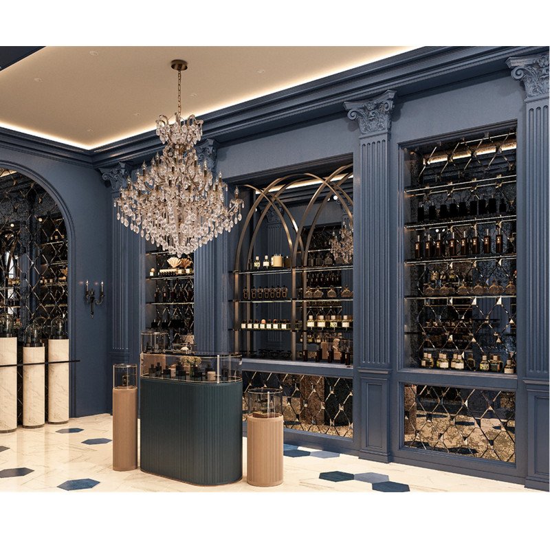
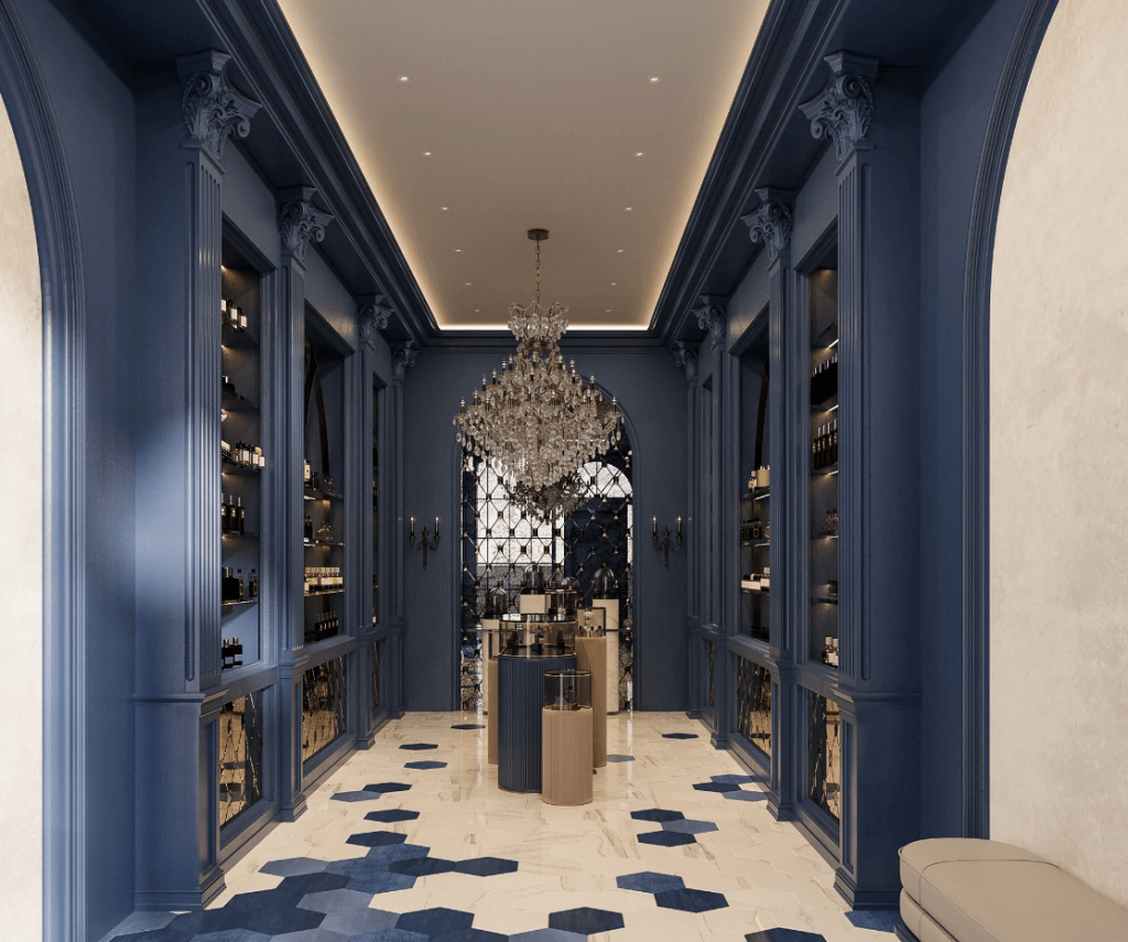
The strategic selection of a dark blue hue for the store’s furniture is a foundational decision with significant psychological impact. Dark blue is intrinsically linked to concepts of stability, depth, intelligence, and trust. It is a color often associated with legacy institutions. Evoking a sense of established tradition and unwavering quality. For a perfume retailer, this color choice immediately signals the products within fleeting trends. This subconsciously reassures customers investing in a piece of a storied heritage. Which justifies a premium price point and fosters a sense of confidence in their purchase. The color acts as a visual anchor, grounding the space in an aura of sophistication. View cosmetics store furniture
Furthermore, dark blue provides a perfect, non-competing backdrop for the main attractions: the perfumes themselves. The bottles, often crafted from clear, amber, or cobalt glass, they can shine without visual competition. The deep, receding nature of the color makes the illuminated bottles appear to float. Drawing the eye directly to their form and the liquid within. This is a critical technique in visual merchandising, ensuring the product remains the hero of the space. The high-end finish of the furniture enhances this effect, reflecting light in a soft. Likely a rich lacquer or velvet-textured paint, diffuse manner that adds to the overall sense of opulence and tactile luxury.
From a practical sales perspective, this environment cultivates a specific customer behavior. The calm, confident atmosphere encourages slower browsing and more deliberate contemplation. Shoppers are less likely to rush in a space feeling so established and serene. This increased dwell time is directly correlated with higher conversion rates and larger average transaction values. By choosing a dark blue palette, the designer has effectively pre-qualified the store’s offerings. Making a non-verbal promise of excellence that the products are then positioned to fulfill.
Grand Entrance Zone
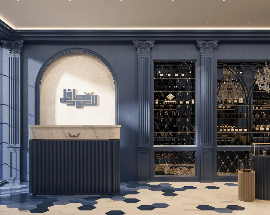
The area a customer first encounters upon entering a store sets the tone for their entire shopping experience. In this design, the left-side service counter is a monumental statement piece. Its semicircular form is a welcoming, organic shape that breaks from the hard lines often found in retail, inviting engagement. The use of white marble with dramatic veining for the countertop is a masterstroke. Marble is a material synonymous with luxury, durability, and classical beauty, having been the material of choice for sculptures and palaces for millennia. Its immediate association is with high value and timelessness.
Flanking this counter is a brand image wall, set against a matching marble background. This is the store’s primary anchor of brand identity. The arched door frame surrounds it is a direct architectural reference to European classicism, reminiscent of portals in historic cathedrals or manor homes. This frame does more than decorate. It sanctifies the brand logo, treating it with a reverence that suggests a deep and respected history. This “halo effect” transfers the authority and permanence of the classical architecture onto the brand itself. Building instant credibility and prestige in the customer’s mind. Learn more about interior design
The integration of square Roman columns further solidifies this narrative. While ornate Corinthian columns speak to opulence, the cleaner lines of square Roman columns suggest a slightly different story—one of strength, order, and empire. The brand imply and its products are on a solid, unshakable foundation. This combination of the semicircular counter, the arched brand wall, and the robust columns creates a powerful and cohesive first impression.
Illuminated Wall Displays
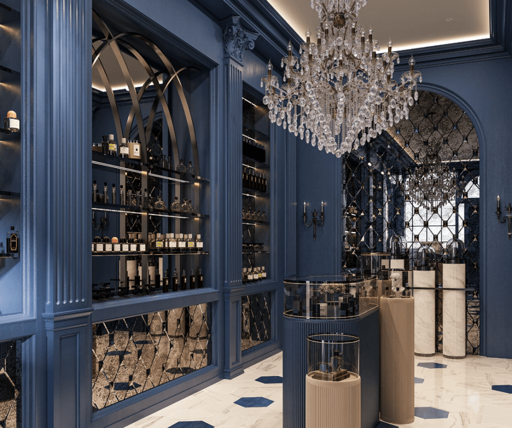
The side walls of the store highly functional and aesthetically striking galleries through the use of wall display cabinets. These are the workhorses of the store, designed to house the full breadth of the perfume collection. The multi-shelving design is pragmatic. Allowing for a logical and spacious organization of products. Whether by fragrance family, brand, or collection. This clarity is essential for a comfortable customer journey. Preventing visual clutter and making the selection process intuitive and enjoyable.
The most ingenious element of these displays has diamond-shaped mirrored stainless steel background. This is a multi-functional lighting and spatial strategy. The faceted, diamond-shaped surfaces act as a complex system of micro-reflectors. Catching and scattering light from the integrated fixtures in countless directions. A dynamic, shimmering effect makes the entire wall appear to sparkle, thereby highlighting the contours and colors of every perfume bottle placed in front of it. The “sense of mystery” mentioned achieve through this fractured reflection. Which partially obscures and plays with the view, inviting customers to look closer and engage more deeply with the products.
Complementing this is the middle cabinet, distinguished by its golden stainless steel frame and arched door with a clear mirror back. The gold frame acts as a precious picture frame, elevating the items within it to the status of curated art. The clear mirror backing serves two key purposes. First, it creates a perception of infinite depth, making the display appear larger and more abundant. Second, and more importantly, it strategically reflects the customer’s own image back at them. This subtle psychological trigger encourages them to imagine the perfume as part of their own identity. Bridging the gap between admiration and ownership. Learn more about perfume kiosk options
Focal Display Showcase
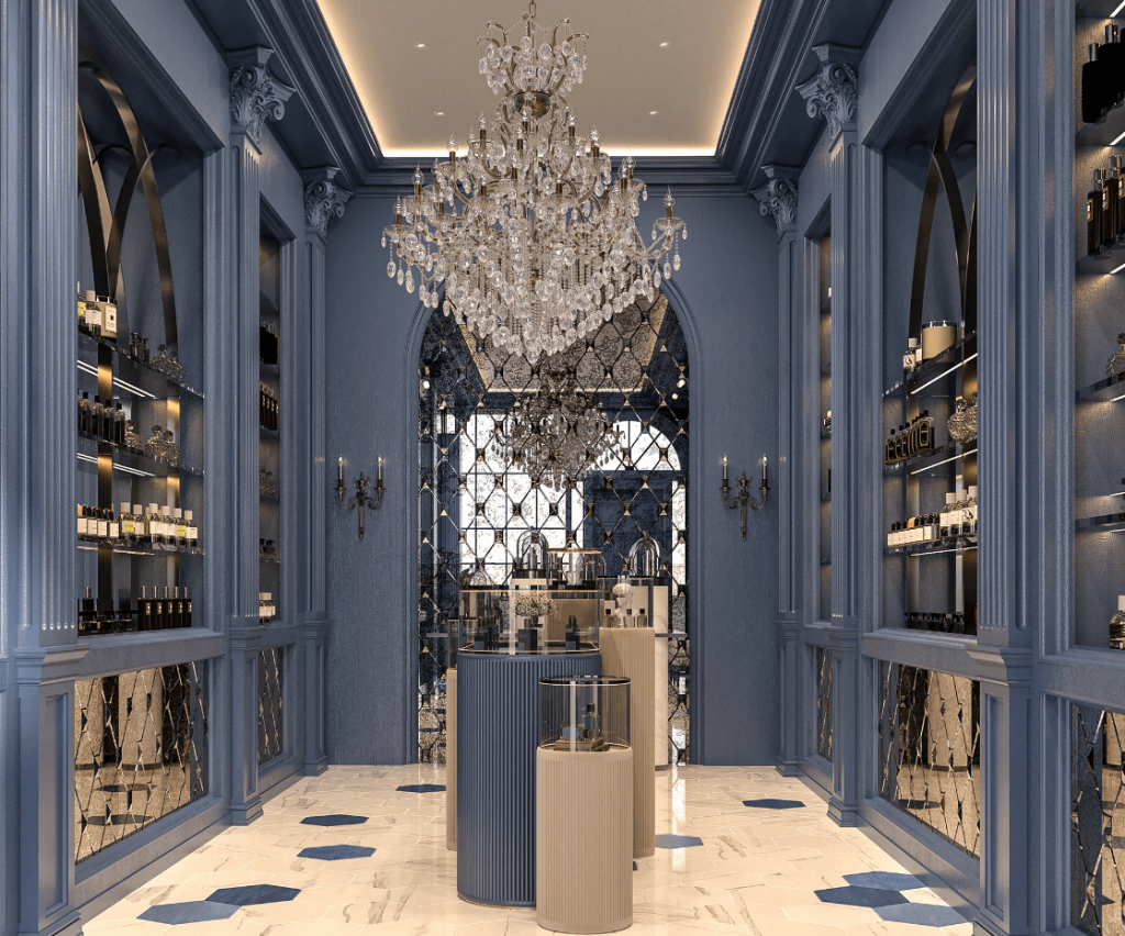
Every retail space needs a climax—a central focal point that captures attention and showcases the most prestigious items. In this design, that role fulfill by the individual dome display showcases at the back of the store. These are architectural vitrines, reminiscent of treasured displays in museums or high-jewelry boutiques. The use of different levels is a fundamental principle of visual merchandising. Creating a dynamic and non-monotonous landscape for the eye to travel across. This allows for the creation of “stories” within the display. Where a primary fragrance elevates on the highest level. Supporting products like ancillary body care or travel sizes.
The repetition of the diamond-shaped mirrored pattern inside the arch doors of these showcases is a critical detail for maintaining thematic consistency. This cohesive design language ties the entire store together, from the walls to the focal point. Reinforcing the central brand aesthetic. The dome shape of the showcase itself is a classical form conveys importance and protection. Lighting within these domes is paramount, typically employing focused spotlights to create pools of light that dramatically illuminate the bottles. Making them gleam and appear almost sacred.
This area is designed for the “hero” products—the flagship fragrances or limited editions that carry the highest margin or brand story. By isolating them in this manner, the design creates a destination within the store. Customers are naturally drawn to this visually prominent area, and the act of viewing these perfumes feels more special and deliberate. It slows down the interaction, encouraging the customer to ask about these specific items. Which in turn gives sales staff a perfect opportunity to share the rich narratives behind them. Further justifying their premium positioning.
Central Interactive Islands
The center of the store is activated by the presence of two beige pedestal glass showcases, surrounded by a green oval glass display case. This configuration is a sophisticated approach to managing customer flow and engagement. The beige color of the pedestals offers a warm, neutral contrast to the cooler, more dramatic dark blue and marble elements. Preventing the space from feeling too austere. These low-profile showcases are for accessibility, inviting customers to walk around them, lean in, and interact with the products.
The surrounding green oval case is a brilliant touch. The oval shape is inherently social and inclusive, encouraging multiple customers to browse simultaneously. The choice of green, particularly in an emerald or forest shade, introduces a subtle but powerful new dimension to the color story. Green is often associated with nature, ingredients, and authenticity. In the context of perfumery, it can subliminally reference the raw botanicals. The herbs, grasses, and woods forms the soul of the fragrance. This connects the finished product back to its natural origins, reinforcing a message of quality and ingredient integrity.
Together, these central islands serve multiple purposes. They dramatically increase the display area, allowing for a greater variety of products to be showcased. They create a natural pathway that guides customers through the space in a fluid circuit. Most importantly, they offer a different type of browsing experience—more tactile and self-directed—compared to the formal wall and dome displays. This variety is key to maintaining customer interest and catering to different shopping styles. From the deliberate browser to the curious explorer, ensuring the store feels rich, layered, and worth thoroughly investigating.