Design and Build a French Fries Kiosk in France
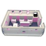
This French Fries Kiosk design shows a new French Fries Kiosk designed for the French market, which cleverly combines modern aesthetics with practical functions to provide customers with a convenient, comfortable and enjoyable French Fries experience. It is more of a mobile fast food restaurant than a simple sales point, taking into account the characteristics of French food culture and urban landscape.
Size and layout
The basic size of the kiosk is not fixed. This French Fries Kiosk design is just a reference size. In actual production, the length, width and height of the kiosk can be adjusted according to the specific needs of the customer to adapt to different venues. This variability of size also directly affects the placement and number of internal equipment to meet the needs of operations of different sizes. Even the setting of the internal workbench can be adjusted, such as increasing or decreasing the number of fryers and lockers, and configuring the appropriate equipment according to the expected French Fries sales.
The exterior design of the French Fries Kiosk is also highly customizable. This design shows a simple and bright style, with yellow and red as the main colors, and a wooden texture counter, creating a relaxed and pleasant atmosphere. However, customers can customize it according to their brand image and target market. Different color combinations can be used, with different patterns and texts, and even some brand logos or decorative elements can be added. In terms of materials, different materials can also be selected, such as metal plates, composite panels, wood, etc., to achieve different visual effects and price positioning. The installation location and type of lights can also be customized to better highlight the product and brand image and enhance the customer’s consumption experience.
The overall shape of the kiosk is rectangular and of moderate size, which is convenient for placement in squares, parks or streets with large traffic. The design style is simple and bright, avoiding overly complicated decorations, which is more in line with the aesthetic preferences of modern French people. The wooden texture counter complements the bright yellow and white color scheme, creating a relaxed and lively atmosphere, which is consistent with the attributes of casual snacks such as French fries. The words “Frites” (French for “French fries”) are prominently printed on the top of the kiosk, using a simple font design to avoid overly fancy visual effects. With bright yellow and the iconic French fries pattern, it quickly attracts customers’ attention and establishes clear brand recognition. This visual language is concise, powerful, easy to remember, and in harmony with the French business environment. The picture on the right shows a close-up of tempting French fries, which further enhances the visual appeal and stimulates customers’ appetite. The overall color scheme is also particularly harmonious in the French cultural context, not too jumpy or out of place.

Functional layout and internal structure
The interior layout of the kiosk is reasonable, making full use of the space and cleverly combining the production and sales areas. From the design drawings, the internal structure is roughly divided into three parts:
Production area: There are complete cooking equipment at the back of the French fry kiosk, including at least one large French fry machine, and storage cabinets for potatoes, seasonings and other ingredients. The application of stainless steel not only reflects hygiene and durability, but also coordinates with the overall modern style. This design ensures an efficient French fry production process and can quickly meet customer needs during peak hours.
Cashier area: Located in front of the kiosk, it is a simple cashier counter for customers to check out. The wooden texture counter design is not only beautiful, but also provides a good customer experience, giving people a warm and comfortable feeling. There may be storage space under the counter for paper bags, tableware and other items. The height of the cashier area design has also been reasonably considered to facilitate interaction between customers and staff. Display area: Located near the cashier area, the design shows several small compartments, which may be used to place sauces of various flavors or already fried French fries for customers to choose. This part of the design cleverly increases the space for product display, allowing customers to see the products at a glance and enhance their desire to consume.
Market adaptability and cultural integration
The design of this French fry kiosk fully considers the market environment and cultural characteristics of France, conforms to the aesthetics of the French, and is simple, bright, and functional. The design conforms to the general aesthetic preferences of the French and avoids overly fancy and exaggerated decorations. The design plan can be adjusted according to actual needs, such as adding kiosks of different sizes or providing different color combinations to adapt to different customer needs and brand images. We can provide personalized customization services according to customer needs, such as customizing brand logos, color matching, etc., to improve the competitiveness of products. This French fry kiosk design shows a French French fry kiosk that is fully functional, beautiful and practical, and has market potential.